

I couldn't really go for a clean cut font with this style of illustration so I decided to pick a font I liked and that went well with the illustration. I then traced round the outline of the font and scanned it in. I will combine this image with the other part of my illustration, pushing me towards my final outcome.
I developed this style further, I did it on a larger scale so that when I reached the outcome I wanted, it would be easier to manipulate on the the computer. This is my final image split in two as it was too big to scan in as one. Again I quite like the sketchy primary style. It is definitely what I want to achieve for my final outcome...


I started off with this rough sketch, it is along the lines of what I want to achieve with my final outcome. Its very sketch and primary. Quite like it, I will develop the style further.

For Media City I want to create a fun iconic illustration. That will consist of a broad overview of all the major buildings. I want the illustration to be fun to look at, memorable, leave an impact of interest and a want to visit the area. For me the illustration wont represent what media city has to offer, as in facilities etc. I want the illustration to be possibly used as a logo. I want it to be instantly recognisable to what it represents.
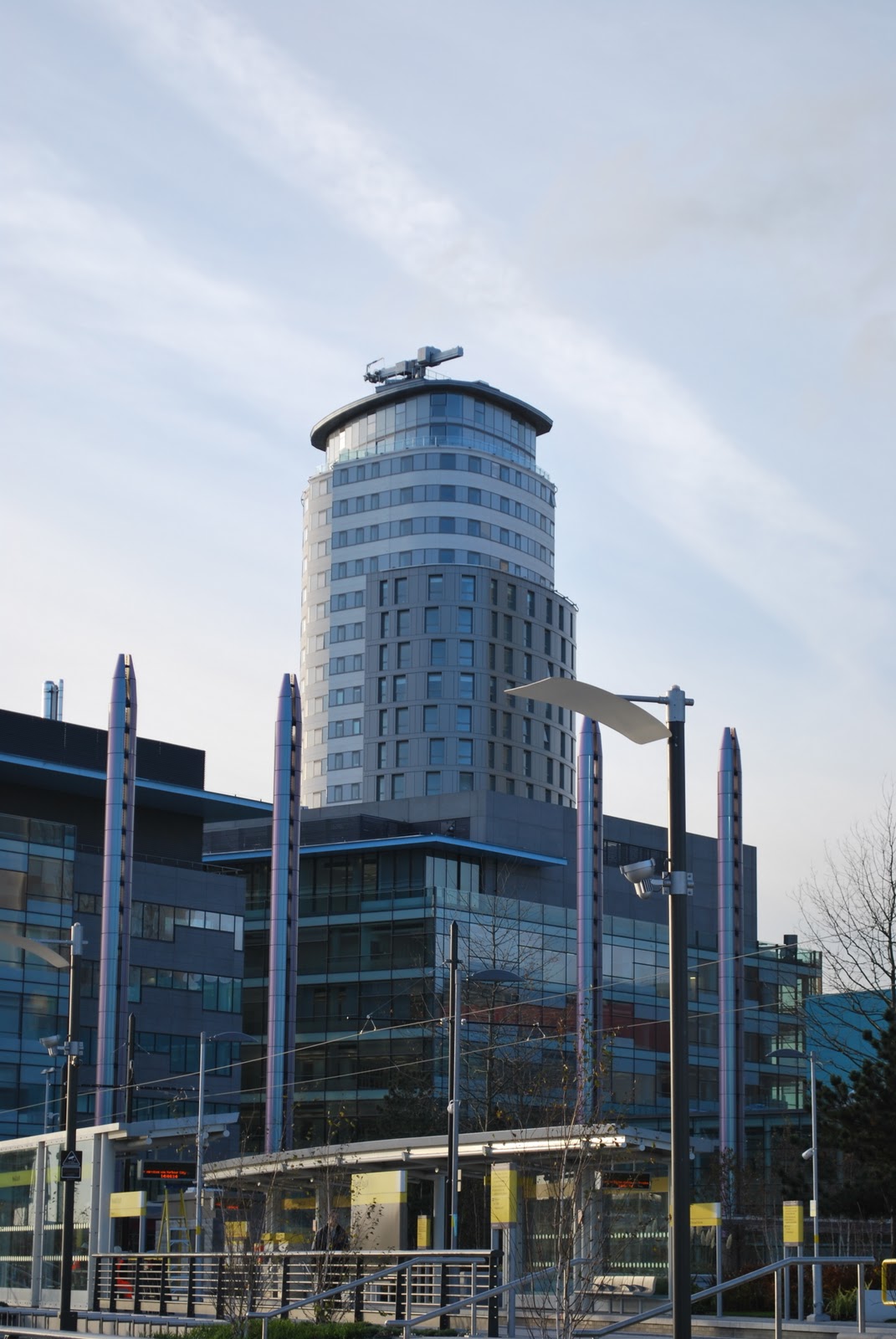
Pictures I took at media city and what I will be developing my illustration from...


I started off by looking at the illustrations of Janice J. They kind of look really scrappy, but this makes them unique and they have so much character. You fall in love with them. The pastel colours she adds to the illustrations also add to their charm. Although even when colour isn't used they are so definitive and unique.


After looking at Janice J, her style reminded me of the illustrations that We Love Music use. I researched who was behind their illustrations to find David Tazzyman. I really love this style, I am going to explore it because of the character exudes...


When exploring David Tazzyman I came across the company; Synergyart. They have some fantastic illustrators that I will try to draw inspiration form. My favourites were, Scott Chambers, who also uses a very hand drawn sketchy style of illustration, I really like how he uses colour in his illustrations, as if the lines hold no boundaries and it can be splashed to any part of the piece. I love how the colours blend and fade also...


Jamie Cullen was another illustrator from Synergyart that was one of my favourites. He has a completely different style to the others I have previously mentioned. You get lost in Jamie's illustrations because there is so much going on, they are quite trippy and kind of resemble the illustration that is used in the movie, Yellow Submarine. They are so precise. The colours are very loud and in your face, the shapes are amazing.

vvv AMAZING!!! vvv


No comments:
Post a Comment